The Go Media Zine holds a special place in my heart. When I was first getting started as a graphic designer Go Media was definitely my guiding light. I spent a lot of time searching around other design firms, trying to get an idea of how I should present myself, and generally how I should try and go about running my business. After stumbling upon (and lapping up) the Go Media website I quickly found myself on their sister blog site; the Go Media Zine. This website offered up not only design tutorials but real world business advice for designers. Needless to say, the Zine was an amazing find for my novice designer self, and the words of Bill Beachy and Jeff Finley quickly became (and to this day remain) gospel.
To put it bluntly, I have become very fond of it
So for the past four years the Go Media Zine has become one of my on-line designer haunts. I check it daily, subscribe to the newsletter and have even had one of my own articles published on it. To put it bluntly, I have become very fond of it- and I have no shame in stating that it acted as a blueprint when designing the Design Range.
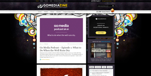
Recently Go Media announced that they were having a total on-line rebranding to try and tie their extensive on-line portfolio together under one uniformed appearance. This initially kicked off a few months ago with the new look Go Media.us website and has now extended to my beloved Zine.

The new look is a huge departure from it’s dark, textured and illustration heavy predecessor
The new look is a huge departure from it’s dark, textured and illustration heavy predecessor, and features a very clean, professional white and grey look. From someone who follows the running of the company (as) closely (as I can), it’s clear that Go Media are trying to push into the next tier of design firm. Originally they began as specialists in illustration and bleeding edge graphic design, however in more recent years their portfolio has leaned toward identity creation and web development. Now this isn’t to say that they have abandoned their roots- in fact anyone who has read Jeff Finleys Threads Not Dead, or attended their Weapons of Mass Creation Fest will tell you that’s far from the truth. However it is true to say the Go Media are growing up a bit. I don’t mean to say that in a negative way, or make it seem as if their prior work was some how ‘lesser’, but it’s evident that Go Media are concentrating less on smaller up and coming businesses and instead are putting a lot of effort into tendering for much larger corporate contracts.
If you’ve listened to the new Go Media Podcast then you’ll have heard Bill remark about how sometimes work just doesn’t come in, and how stressful that can be for a large design firm that has employees expecting their wages at the end of the month. In some ways I think that this new look and new approach is an answer to those concerns, and from my perspective at least, I find it incredibly exciting to watch a design firm step out of their comfort zone to try and achieve greatness.
Sorry- I’m getting totally side-tracked here. This is suppose to be a review of a new website design, not a company analysis!

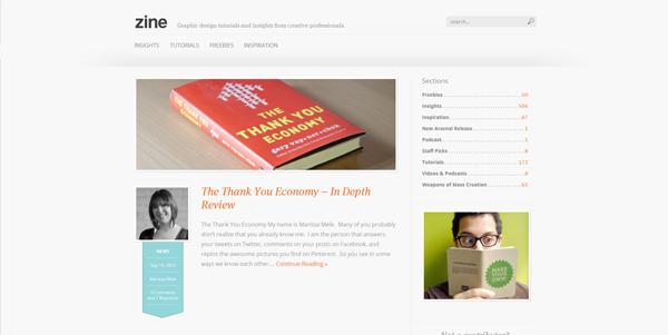
To get back to the Go Media Zine (aptly now renamed to simply ‘Zine’) it’s clear to see that the Go Media team don’t do rebrands by half. Far from a simple re-skin, the whole of the website functionality and layout has been redone to meet modern standards in web and blogging design.
I actually went from one website to the other and back again without realising it!
The home page greets you with a nice chunky view of the latest post with a big image and unusually large picture of the author which is nice to see. Below this, other recent posts are divided up with only the next two articles having featured images and text samples, and the remaining six being displayed only through their title. This stops the home page from feeling overly long and means that any visitor doesn’t have to scroll for too long before finding themselves at the all important footer. Go Media is using an almost identical footer to that of their main portfolio website and the links within it act as a strong bridge between the two websites (I actually went from one website to the other and back again without realising it!).

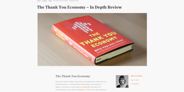
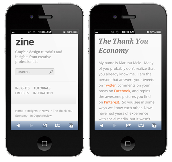
The article posts themselves are really something to behold with a huge 1120+ pxl wide image that spans the full width of the page alongside the epic article title typed out in 43px! (in a very sexy looking FF Meta Serif Web Pro font I might add). To say that the Zine is going big is an understatement. Although all this largeness is quickly undone by a curiously narrow content body. I’ll admit that I was a little perplexed by this at first and even though the extra space on the left is well utilised by some choice block quotes, it seemed like a bit of an odd move to me. That was of course until I check out the website on my iPhone.

Design like this is really forward thinking
The whole of the new Zine (and indeed the rest of the new breed of Go Media websites no doubt) is fully responsive and adapts well to any screen size. This means that when viewed on a mobile device or tablet, the website adapts it appearance to display in the best way possible (rather than just shrinking the whole thing down and have you scrolling around it). With this considered, the new narrower article body fits very well with the look of the website when viewed on a mobile device, and a very strong sense of synergy is created that is often lost when comparing a desktop website to it’s mobile counterpart. Design like this is really forward thinking and it’s something that I’ve actually implemented right here on the Design Range (try resizing this window to see what I mean). The upshot of all this is that the new Zine behaves more like a native app when viewed on a mobile than it does a website (although there isn’t yet an iOS compatible favicon to make it look like one yet- just an idea).
The only thing I’m not 100% taken with on the new design is the lack of author bios at the end of posts. Admittedly, authors are now shown off much more prominently in their large images at the top of the page, but there is still a distinct lack of information about just who these people are. It may just be me here, but when I really enjoy an article I like to know who wrote it, and I don’t just mean their name.
All in all (as I’m sure you’ll have guessed by now) I’m totally in favour of the new look Go Media Zine and will continue to be an avid reader for as long as the team at Go Media keep posting articles.
If you’re a fellow follower of the Zine, I’d love to hear what you think about the new design. Do you love it, or loath it? Do you long for more familiar ground or relish this fresh new venture? If you’ve not heard of the Go Media Zine before then I strongly encourage you to check it out. If you like what you read here then you’ll no doubt be just as enthralled with the offerings of Go Media, so check them out and be sure to report back with your opinions on the website design!
[one_half]If so, why don’t you consider subscribing to The Design Range Newsletter? You’ll be kept informed once a fortnight on all the latest articles as well as exclusive tips and tutorials on increasing your income from graphic design.[/one_half][one_half_last]
[/one_half_last]