When there’s nothing you can take away from the picture, the picture is perfect. In a nutshell, that’s what a minimalist design is all about.
Both artists and enjoyers of art love it for its refined cleanness and smooth execution, while web designers use it for its effortless readability. Though grids, negative spaces, divine proportions and visual balance create a framework for its aesthetics in architecture, it’s typography that translates it into a compelling graphic design.
Together, they attract and retain a curious eye. Here are some examples.
But first, let’s see how minimalist typography is usually done.
In every design, the main purpose of topography is to convey a message. When it comes to minimalism, straightforward communication is even of greater importance, since not much of the meaning can be drawn from the design itself.
That’s why every other graphic design company chooses to inhabit its minimalist worlds with typographical simplicity. Though one might think that mostly blank composition would ask for intricate typefaces that’s usually not the case. Instead of vibrant colors and convoluted lines, minimalist designers opt for minimal fonts that are aesthetically pleasing and easy to read at the same time. It’s actually in between the lines that we find creativity.
If “less is more” is a rule in design, then “the bigger, the better” is the main principle for its textual context. Such an approach is in perfect unison with the simplicity request, while simultaneously guaranteeing utmost clarity of meaning. Big and bold works are great for custom graphic designs that don’t rely too much on images, but use text as a leading visual medium.
As one of those, minimalism calls for geometric shapes, crisp edges and clean lines. It pays a great deal of attention to hierarchy, composition and spacing, thus creating more empty space and allowing for letters to breathe. Though consistency in size is not a general rule, its large typography that captures the eye, makes important information clearly visible, and keeps the canvas tidy and clean.

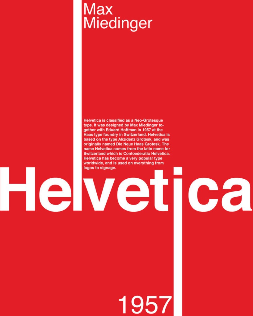
Helvetica is a topography darling of all minimalist designers. Since a decade ago, it’s also a documentary star, thanks to the fervent Gary Hustwit. A recent study showed that it makes a greater visual impact than Verdana, Comic Sans and Arial together, but that’s not the only reason why Helvetica is so popular among graphic designers.
Its plainness allows, nay, tempts you to be as creative as possible, while urging you to stay within the limits at the same time. As such, it offers infinite possibilities, with all of them being equally simple and transparent. “You can say I love you in Helvetica, and you can say it with Helvetica Extra Light if you want to be really fancy”, as Massimo Vignelli famously explained. “Or you can say it with Helvetica Extra Bold if it’s really intensive and passionate.”

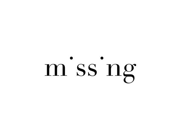
Minimalism leaves you plenty of space to dream, think and devise. Since simple and straightforward, this design is made for intelligent expressions of powerful ideas, which is something that typograms are unparalleled in. In this clever visual language, the word “missing” is spelled without both i’s, though diacritical dots are left intact.
O’s usually hover above the remaining letters of the “balloon”, while n’s in “tunnel” form an underpass. By playing with whole words or individual letters, typograms explain their literal meanings through the deliberate use of typography. Not only that this draws our attention, but it clutches it so strong that it rarely ever leaves our memory.
Typograms are a brilliant example of how true creativity works. Whether you’re handed a blank piece of paper or an uninteresting idea, it’s up to your artistic mind to imagine and create a new, compelling landscape. Minimalists, on the other hand, often choose to stay restricted. But, true artists were never big on following rules.
What’s considered a representative corpus of traits in any design can be found exclusively in the work of mediocre artists; unable to break the mold, they stay within the norm. Greater designers seamlessly fuse minimalism with other, more complicated styles. Vintage typography, for instance, is a case in point. It’s still simple enough to be used with minimalist grids, though its decorative nature certainly ads some flair to the otherwise empty space.
Perfect for logo design, calligraphy is another lettering style that elevates minimalist composition. This visual formula might not ensure perfect readability, but with some forms of creative graphic design, directness is not so necessary at all.
A minimal, black surface is wonderfully complemented with extravagant, gold handwritten topography, for example. When placed within a ring, calligraphy makes a great choice for circular logo design. It’s amazing for signatures and initialsand thus, frequently used in wedding invitations as well.
If minimalism implies a blissful absence of complexity, then its typography that needs to communicate the meaning, voice,and emotion. Together, they make a perfectly balanced juncture of atmospheric calmness and visual stance.