Design has come a long way from simple forms of visual expression to one of the driving forces behind every industry. Once upon a time, illustrations served only as decorations for product packages and wrappings.
Today, however, with the globalisation of different markets, the message sent and conveyed by design solutions is as important as the very quality of products. Since companies that go for unique and attractive design usually have stronger brands, it’s important to look up to the marvels of different industries, so as to generate smart branding strategies.
The importance of nonprofit organisations is rising simultaneously as the Internet is spreading. This is why such entities need to emit care and comfort above everything else.
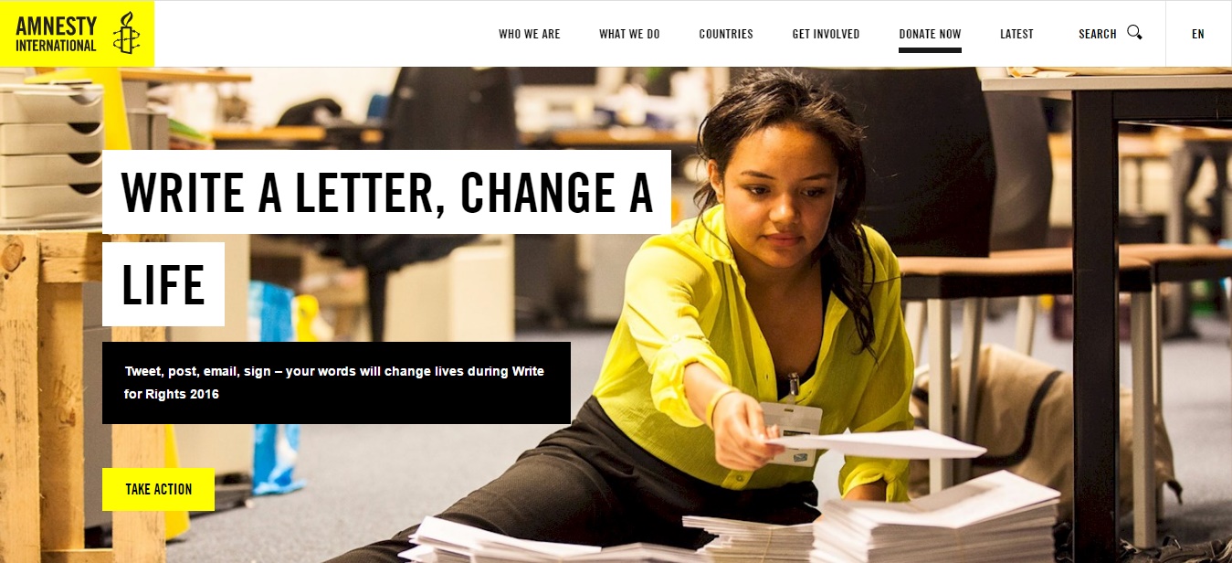
Since yellow is the colour of happiness and optimism, it’s no wonder that AI have yellow and black as main colors in their logo. It reflects their major goals – offering people whose lives are in danger hope and direct solutions for their problems. Also, their website has three simple yet efficient visual solutions that call to action, aiming both at victims of different conflicts and people who are ready to help them.
When you look at the Greenpeace colour scheme, it’s beautiful to see how well they’ve incorporated their mission into their visual identity. This combo of green and white emphasises their desire to preserve the nature and keep it pure and intact. Also, they work hard on increasing ecological awareness through social media campaigns.
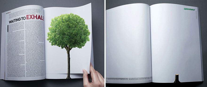
Due to their non-profit nature, those organisations should always keep their designs simple, but inviting. They will be more efficient in doing good deeds if they send universal visual messages. You can see more examples of how websites can be effective at raising their brand identity.
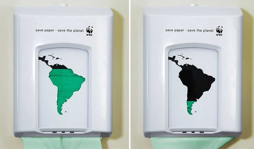
When the world is as diversified and complex as it is, it’s necessary to divert people’s attention to important aspects of different communities. With the viral nature of the Internet, it’s much simpler to raise social awareness these days, than it was in the past. WWF is an example of an organisation that established its brand identity using highly-efficient campaigns.
Another example is the Cystic Fibrosis Trust that launched a successful identity campaign with “hinting at the presence of cystic fibrosis without actually showing or saying it.”
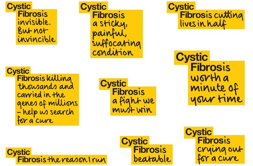
Custom handwritten font by Nick Cooke and identity campaign developed by Johnson Banks.
The market of small businesses has undergone the most significant changes in the last few decades. It’s mainly so due to the rapid development of the Internet. Thanks to the availability of modern communication tools, small businesses can nowadays also use creative designers to come up with solutions that used to be reserved only for large companies.
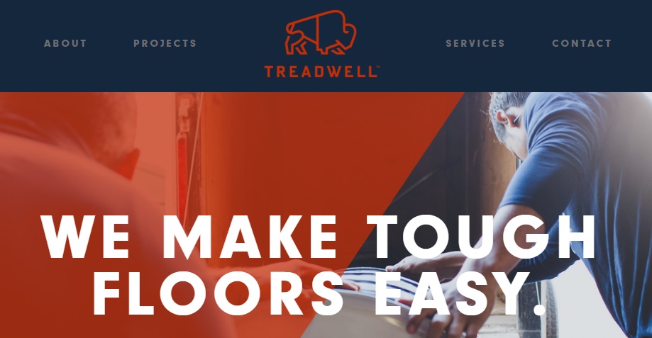
the owners of this flooring small business, placed in Kansas City, decided to give their startup a touch of unique branding. Therefore, their designers decided that their logo should be dominated by a roughly sketched buffalo. It sends a clear message that you can rely on this sturdy and reliable flooring manufacturer. Also, the name clearly indicates that you can really walk hard and long on their floors.
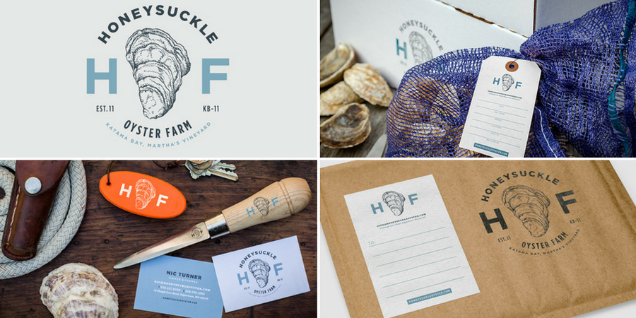
When you have a look at the logo of this oyster producer, located in Martha’s Vineyard, you can see how important it is to associate the colors to the type of business. A perfect blend of vintage blue and grey, this rounded logo with a drawing of an oyster in the middle communicates tradition. This generates loyalty in their old customers and invites new ones to get oysters from them.
Also, small businesses should target their local market with leaflets and different giveaways. Most effective are those that are reusable and serve a purpose like high-storage custom USBs, t-shirts, keychains. Of course, with their logos and taglines printed on those freebies.
The need for outstanding branding solutions doesn’t wear off even when you’ve already grown into a global brand and built your identity. On the contrary, industry marvels should continue creating inventive redesigns and campaigns, as well. Often, just a slight logo redesign can help maintain and improve the brand identity of industry giants. Johnnie Walker is the perfect example. This whiskey brand has always aimed at distinguished clients. However, new times dictate new targets, resulting in some logo changes. Johnnie’s tradition is preserved and amplified with the “Keep walking” tagline. What’s different are the figure of the gentleman and the letters. The former is drawn with thinner, sleeker lines. The latter are typed and not handwritten – a move towards the millennial audience.

Big or small, local or global, you have to make your brand stand out from the crowd in every way possible. Now that everybody uses computers and gadgets, people are mostly exposed to visuals. This is why visual communication is the key feature of every successful brand. Therefore, businesses have to incorporate visual design and brand communication into their business strategies. This will, in return, yield recognition, respect and loyalty.