Nowadays, people are probably not as riled up as they were when Facebook first introduced the Timeline model. For a while, a number of users refused to shift from the old format voluntarily because they found Timeline very disorienting, with its two columns and how it has to be processed in a zigzag manner to follow the events chronologically. This just goes to show how important website design orientation is – whether it’s portrait or landscape or a mixture of both, it has to help the user process data on your site better.
To choose the proper design orientation, it depends on a couple of things: the type of content, and the device used for viewing.
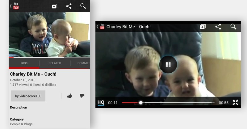
More often than not, videos are best viewed when in landscape format – think TV screens or monitors. Most sites make sure this is the case when viewers choose to watch the full screen version. On the other hand, when the video is to be viewed along with the description and comments, portrait format is used, assuming that after watching the video briefly, the viewer will immediately scroll down to read or type something else.

In case of photos, it’s pretty much the same with videos, only that there aren’t so many ‘shots’ within a given time frame, so to speak. Photos would include graphs and charts as well.
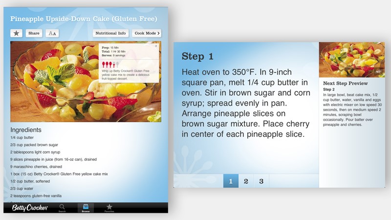
For books and lists, the typical orientation used is portrait – as most books are. The portrait orientation facilitates reading by limiting the left-right movement of the neck and eyeballs. It’s also much easier to see more items on a list given a portrait orientation.

We are most familiar with desktops and laptops, but nowadays a lot of browsing is done through mobile devices, and it’s important that your website can be properly viewed through smaller screens. On shifting between portrait and landscape orientations, here are a couple of approaches used:
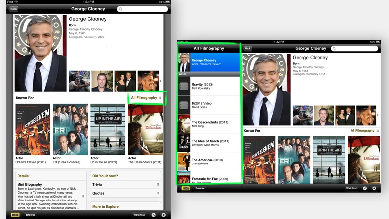
Extended: When orientation is changed, it provides additional data on top of what is already shown. It effectively expands the current content.

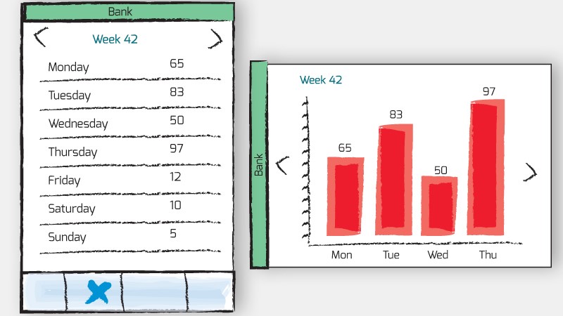
Complementary: With the shift, a different perspective is provided regarding the same information, for elaboration or emphasis.

The shift between orientation has to have a purpose, to engage viewers and keep them coming back.
Unlike other things, there is no such thing as one size fits all in website design, so make sure to think ahead and consider carefully these two things: what are the most important things you want to get across, and where are viewers most likely to access this information.
Photo Credit to Robert Scoble[one_half]If so, why don’t you consider subscribing to The Design Range Newsletter? You’ll be kept informed once a fortnight on all the latest articles as well as exclusive tips and tutorials on increasing your income from graphic design.[/one_half][one_half_last]
[/one_half_last]