Ages and ages and ages ago I used to work as Art Director for a music magazine, I think I got about eleven issues under my belt before I decided to leave to do graphic design full time.
Every now and again (usually when I’m moving office) I uncover that stack of magazines I kept and have a quick flick through them. The last few were pretty average design wise, certainly nothing to shout about, but the first one or two I did, oh man… they were shit.
When I was working on those first few issues, I didn’t really have any idea how a magazine worked in terms of design. I didn’t understand things like white space and continuity of style. In short I made every page different to the last in what was basically a cluster-fuck of typography and layout. Eventually I started to research other magazines and realised that for the most part there was a set of rules that every page followed, a style that ran throughout the magazine. Every now and again there would be a ‘feature article’ that would have it’s own style but for the majority of the pages, they were instantly recognisable.
So for the longest time, I’ve thought that that was where I went wrong on those first couple of issues, but then I got on a Vietnam Airlines flight.
-Weird tie in I know, but watch me bring it back quick snap.
On Vietnam Airlines flights you get a magazine called Heritage (-there you go), you know the kind I’m talking about; back few pages is your flight path, couple of articles about national treasures and then a section for cheap perfume and model planes you can buy in flight. I normally don’t bother with stuff like that, but the book I was reading went really downhill and the only other thing I had on my Kindle was a Lonely Plant guidebook that I had already rinsed, so I decided to give Heritage a flick through.


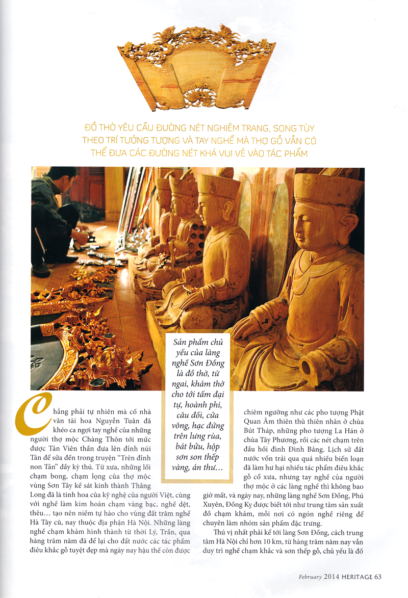
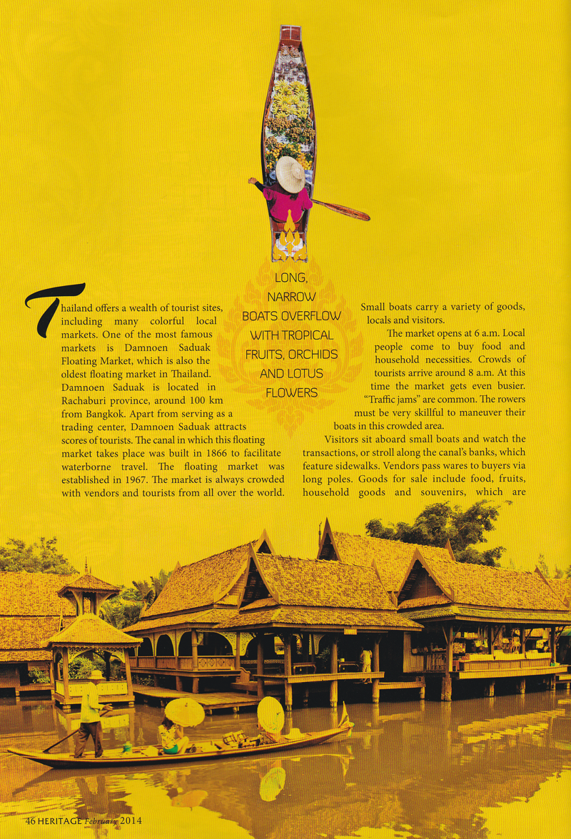
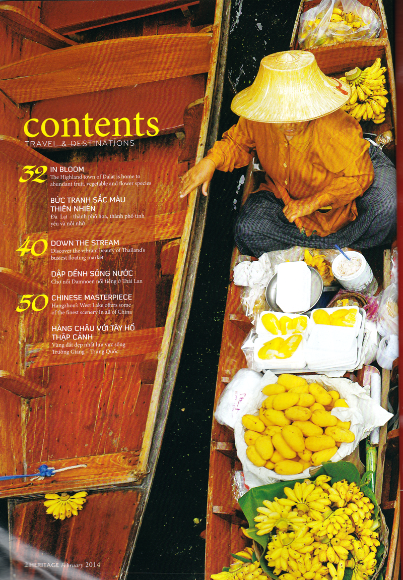
I was pretty damn impressed with it. It wasn’t like any of the pro magazines I’d spent my time researching, if anything, it was more like those first few issues I’d designed. Nearly every article had a different page design (in fact each article had two page designs, one in English and then another totally unique design in Vietnamese). The only difference was, Heritage looked really good.


Initially that bummed me out a little, because it therefore meant that I was just a really crap designer when I first started on the magazine, but that’s probably true. No doubt I’ll think the same thing of my work now in another 10 years and get bummed out all over again.
But then I started thinking, if unique article designs can look this good then why do we restrict ourselves with design standards and rules? Now I don’t work on magazine design that much any more, but I do work on web based design and that’s probably more guilty of obeying set rules than any other medium I can think of, and it’s all thanks to CSS (-I may go for the world record of how much I can write before linking in to the actual article title one of these days).
Back in the day websites had to be designed solely in HTML with every page being hand written with inline styling (-I write that like I was there, ha!), granted there were templates you could build and then fill in the gaps with content but you at least had the opportunity to make design decisions right then and there. Now we use CSS frameworks (for the most part) to design our pages; a set of rules and design guides we come up with beforehand that we can just throw content at and have it come out the other side looking beautiful. We have websites that all have identical page designs, that are super easy to set up and incredibly quick to publish. But why?
Websites have insane readerships historically speaking. I have no idea what official statistics are, but I bet if you held the readership of the top ten websites in the world up against the top ten magazines, the magazine would be utterly dwarfed. Yet I also bet you the magazine has way more hours put into it’s design every month. I bet the websites even make more money.
Does that seem right to you? That one medium can have a larger readership, generate more revenue and yet deserve less care in it’s design?
I think we might have got so locked on to the notion of speed and efficiency that we might have overlooked aesthetics.
What would a website be liked if we decided to bin CSS frameworks? What would it be like if every time you viewed an article it was presented to you in a style beautifully and specifically designed for it? Wouldn’t that be something?
We don’t do that because a great many websites churn out a lot more content than magazines and designing every article individually would take more time meaning they would loose their ‘scoops’ and it would straight up cost more. Honestly though, I’m not talking about those sites.
I’m talking about the kind of site that produces ‘evergreen’ content. Articles that aren’t fleeting, that will stay relevant for months and years, be seen by hundreds of thousands of readers and hopefully generate a lot of cash.
If income and readership support design time. Why not?
edit- thanks to Liam Wright, who helped me clear up some of my generalised terminology in this article.
[one_half]If so, why don’t you consider subscribing to The Design Range Newsletter? You’ll be kept informed once a fortnight on all the latest articles as well as exclusive tips and tutorials on increasing your income from graphic design.[/one_half][one_half_last]
[/one_half_last]