Archive: Feb 2017

  1. Hacked again? The what, where, & how of the threat we all face!

    Comments Off on Hacked again? The what, where, & how of the threat we all face!

    I remember it like it was yesterday. I had taken my business from a couch on a Saturday afternoon with zero clients to a thriving business with over 150 monthly recurring accounts and growing. Life was good; business was thriving; and then it happened. There was a vulnerable plugin on one of my client’s sites and that was all that it took to have over half the sites on my dedicated server defaced with some elementary pixel art from Turkey.

    The truth is that we are all vulnerable. The beauty of open source content management systems is that they are—how can I say this?—Free! Oh yeah, and the other benefit is that you don’t have to custom develop a feature for your client when they throw an “out of scope” request your way. You can go right over to the WordPress plugins repository, Joomla repo, or wherever your favorite CMS collects their library of community uploaded add-ons, and boom you have a feature for your client without any development sweat equity at all. Sure you may have to do a few minor CSS tweaks here and there, but you can have something that would have taken days or weeks to develop for free or a very low cost. Your client is happy and you look like a genius. That is until “D-Day” comes. “What is “D-Day” for us?” you ask. It is that day you wanted to take your kid to the park, had the whole day planned out, then you get the news from one client after another that they don’t speak Turkish so why is there weird music and links on their page? Ugh! Seriously?

    If you have been in this business long enough and you do development on open source content management systems you have probably at one point or another dealt with a hack or like me in my beginning years a lot of hacks all at once. This brings us to the point of this post. I want to briefly look at the what, where, and how of a hack. Hopefully this will give you some insight on the before and after effects of a hack, and what you can do to put yourself in a better position as a website entrepreneur or as I have coined it, a “websitepreneur”.

    The What

    What did these people from a far-away land do to my site in the first place?

    The best thing you can do as a “websitepreneur” is to get familiar with the core code of your CMS. WordPress does not have nearly the amount of core files that you would see in Joomla, Drupal, or the heavyweight Magento, but no matter what your CMS choice is you need to get familiar with the core files. Every time I have had a hack I have logged in through SSH or even the file browser to look at the core files. Time stamps will be off, weird folders with either very close names to the original or ridiculously dumb names like “escorts-from-new-zealand”, or “pickles” will appear in the folder structure of your client’s teddy bear website. I mean why would teddy bears need escorts from New Zealand, right? These kinds of hacks are easy to find but can be a quite a challenge with the more file heavy CMS’s with folder structures that dive into dozens of layers deep.

    There are some key indicators that I have found that are sure tell signs that you have been hacked. Most hackers do not deface your website. That is too obvious. The more popular hack is to hide somewhere in your site for years. They like to hijack your traffic and redirect them for profit. Here are some signs that you can look for that most likely point to hack activity.

    • Drastic search engine position changes
    • Redirected pages
    • Rapid drop In traffic
    • New code or files that you or your customer have not placed
    • Google blacklisting
    • Reports from visitors getting viruses or warnings
    • Drastically slower website load times
    • Partial web pages loading
    • Weird links in the bottom of your pages
    • Your site just stops working for no reason

    If you are experiencing any of the symptoms above there is a good chance you have been hacked. Don’t ignore symptoms as they are pre cursors of uglier things to come if left ignored. A hacker if left in a shared un-protected environment (aka cheap hosting) can actually gain control of more than just one website. They can affect multiple sites or even the DB which can be catastrophic. (I have actually had to rebuild dozens of sites) Hint: Cheap hosting is not really cheaper in the long run.

    The Where

    Where is the vulnerability so I can close this dang thing?

    You have determined that you have been hacked. Your client’s site is jacked and you have cleaned up the weird files that did not belong. You are not finished yet. Leave that baby unchanged for another day or two and your one friend from Turkey will bring some friends from countries you have never heard of before. There are actually websites out there that tell their peers when there is a vulnerability and your site or your whole server can be posted for all the hackers to use as a playground for all kinds of not so fun activities at your expense. Here are some ways you can pinpoint a hacker’s penetration point so that you can fix the hole they are coming in at.

    The How

    How do I protect my sweat equity from getting jacked, I mean hacked, in the future?

    There are really 2 things that contribute to most hacks. One is that your CMS is not keep up to date. The other is that you have an extension or plugin that is not up to date or that is not coded to spec for a secure environment. This means there are two things you can do to prevent a hack.

    1. Check your CMS website or community websites that deal with that CMS and look for a vulnerable extensions or plugin list. Make sure your theme, extensions, plugins, are not on the list. If they are upgrade or remove immediately.
    2. Keep your CMS up to date. That means within the first week or so that the patch comes out. Don’t wait to upgrade the CMS. There are often times bugs that are being patched but holes that hackers can enter are also usually a part of those patches.

    The Don’t Do This at the Home Section

    In some cases you inherit a website and are going to be the webmaster for a website that is not able to be upgraded. This hopefully is a temporary problem while you redesign something new and up to date but none the less you will at some point probably inherit an older CMS website that cannot be patched. I have found one thing that will save a world of hurt in this scenario and it is called Cloud Linux. You can cage each site separately so that one site does not drain all of your server’s resources. It may make the hacked site go down or perform poorly but it will not affect your other websites. Cloud Linux also prohibits hackers from gaining access to other sites on the same server all at once with root privileges.

    Whenever I inherit old PHP driven CMS sites that cannot be updated right away I always place them on a box with Cloud Linux. After doing this for over 15 years I have found it to be the best tool against mass hacking out there for vulnerable un-patchable sites.

  2. Minimal Graphic Design: 5 Great Typography Designs

    Comments Off on Minimal Graphic Design: 5 Great Typography Designs

    When there’s nothing you can take away from the picture, the picture is perfect. In a nutshell, that’s what a minimalist design is all about.

    Both artists and enjoyers of art love it for its refined cleanness and smooth execution, while web designers use it for its effortless readability. Though grids, negative spaces, divine proportions and visual balance create a framework for its aesthetics in architecture, it’s typography that translates it into a compelling graphic design.

    Together, they attract and retain a curious eye. Here are some examples.

    Some General Ideas

    But first, let’s see how minimalist typography is usually done.

    In every design, the main purpose of topography is to convey a message. When it comes to minimalism, straightforward communication is even of greater importance, since not much of the meaning can be drawn from the design itself.

    That’s why every other graphic design company chooses to inhabit its minimalist worlds with typographical simplicity. Though one might think that mostly blank composition would ask for intricate typefaces that’s usually not the case. Instead of vibrant colors and convoluted lines, minimalist designers opt for minimal fonts that are aesthetically pleasing and easy to read at the same time. It’s actually in between the lines that we find creativity.

    1. Big & Bold

    If “less is more” is a rule in design, then “the bigger, the better” is the main principle for its textual context. Such an approach is in perfect unison with the simplicity request, while simultaneously guaranteeing utmost clarity of meaning. Big and bold works are great for custom graphic designs that don’t rely too much on images, but use text as a leading visual medium.

    As one of those, minimalism calls for geometric shapes, crisp edges and clean lines. It pays a great deal of attention to hierarchy, composition and spacing, thus creating more empty space and allowing for letters to breathe. Though consistency in size is not a general rule, its large typography that captures the eye, makes important information clearly visible, and keeps the canvas tidy and clean.

    2. Helvetica

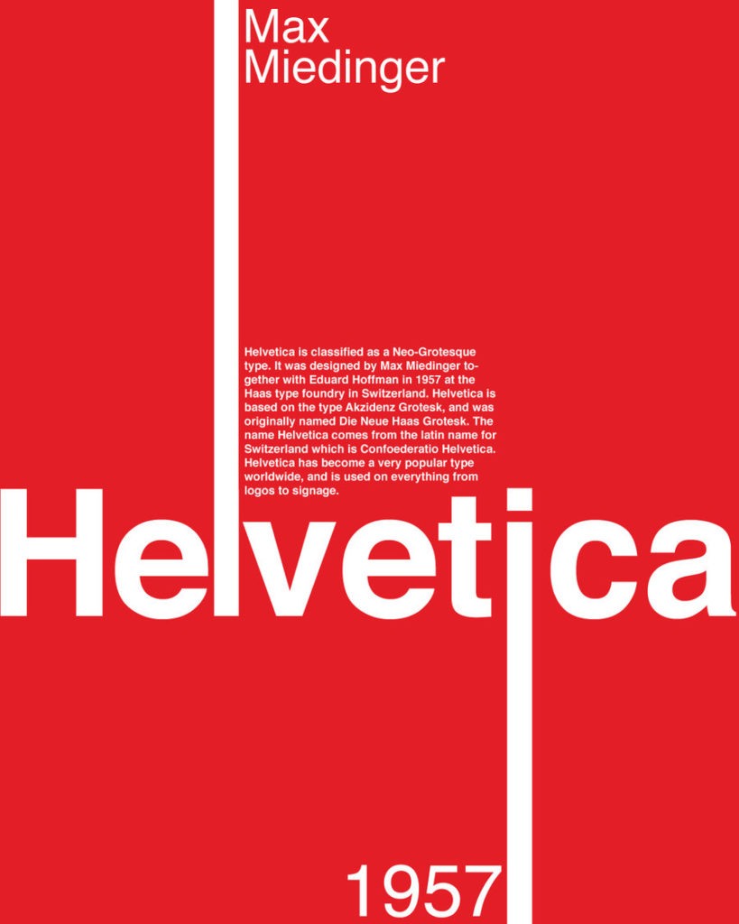
    Helvetica is a topography darling of all minimalist designers. Since a decade ago, it’s also a documentary star, thanks to the fervent Gary Hustwit. A recent study showed that it makes a greater visual impact than Verdana, Comic Sans and Arial together, but that’s not the only reason why Helvetica is so popular among graphic designers.

    Its plainness allows, nay, tempts you to be as creative as possible, while urging you to stay within the limits at the same time. As such, it offers infinite possibilities, with all of them being equally simple and transparent. “You can say I love you in Helvetica, and you can say it with Helvetica Extra Light if you want to be really fancy”, as Massimo Vignelli famously explained. “Or you can say it with Helvetica Extra Bold if it’s really intensive and passionate.”

    3. Typograms

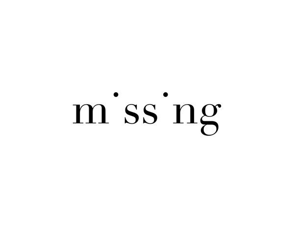
    Minimalism leaves you plenty of space to dream, think and devise. Since simple and straightforward, this design is made for intelligent expressions of powerful ideas, which is something that typograms are unparalleled in. In this clever visual language, the word “missing” is spelled without both i’s, though diacritical dots are left intact.

    O’s usually hover above the remaining letters of the “balloon”, while n’s in “tunnel” form an underpass. By playing with whole words or individual letters, typograms explain their literal meanings through the deliberate use of typography. Not only that this draws our attention, but it clutches it so strong that it rarely ever leaves our memory.

    4. Vintage

    Typograms are a brilliant example of how true creativity works. Whether you’re handed a blank piece of paper or an uninteresting idea, it’s up to your artistic mind to imagine and create a new, compelling landscape. Minimalists, on the other hand, often choose to stay restricted. But, true artists were never big on following rules.

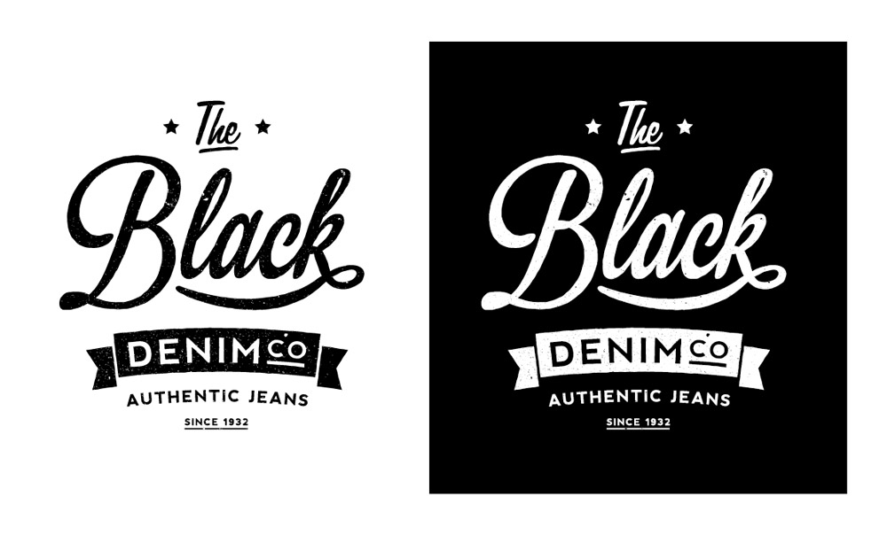
    What’s considered a representative corpus of traits in any design can be found exclusively in the work of mediocre artists; unable to break the mold, they stay within the norm. Greater designers seamlessly fuse minimalism with other, more complicated styles. Vintage typography, for instance, is a case in point. It’s still simple enough to be used with minimalist grids, though its decorative nature certainly ads some flair to the otherwise empty space.

    5. Calligraphy

    Perfect for logo design, calligraphy is another lettering style that elevates minimalist composition. This visual formula might not ensure perfect readability, but with some forms of creative graphic design, directness is not so necessary at all.

    A minimal, black surface is wonderfully complemented with extravagant, gold handwritten topography, for example. When placed within a ring, calligraphy makes a great choice for circular logo design. It’s amazing for signatures and initialsand thus, frequently used in wedding invitations as well.

    If minimalism implies a blissful absence of complexity, then its typography that needs to communicate the meaning, voice,and emotion. Together, they make a perfectly balanced juncture of atmospheric calmness and visual stance.

  3. Top Web Design Trends in 2017

    Comments Off on Top Web Design Trends in 2017

    In November we posted our article on 7 graphic design trends for in 2017, now thanks to this amazing infographic from My Biz Niche you can discover the top web design trends that web designer are adopting this year too. From simple and closed compositions to more open-styled, seemingly chaotic, “broken” and cut compositions.

  4. Mobile First Web Design: What To Expect In 2017

    Comments Off on Mobile First Web Design: What To Expect In 2017

    I have been designing websites for over 15 years now. Typically, when I begin a web design project, the default has always been to start with the desktop view in mind and work the design to look beautiful on mobile devices once it laid out great and looked magnificent on a desktop or laptop screen.

    The mobile design aspect has always been secondary to the layout on a full-size screen. When responsive design became ultra-popular, I still worked my way down to mobile in the end, rather than starting with that aspect in mind first.

    I noticed that a lot of web designers in our industry are now beginning with a mobile-first design and designing the project to look beautiful on mobile first. Once they have laid out the mobile version, they proceed to bring out the beauty of the web project on the large screen last.

    1.2 Billion Mobile Web Users Currently Active In The World

    If you think that mobile web design is a fad or a trend, you’ll be quite surprised with these statistics I recently discovered. According to recent statistics online, mobile design and mobile marketing is the future and the future is here. Any web designer worth their weight knows that the key to future success is optimizing their web project to the mobile market and for the mobile user. The following statistics will give you an idea of how amazingly huge mobile first design is becoming and why:

    • Verizon Wireless recently did a survey with their mobile customers and claims that 90% of Americans bring their mobile device to the bathroom with them. People are so attached to their mobile devices that they are bringing them with them everywhere they go. I am guilty of this statistic myself! As I write this, I am thinking of my last trip to the porcelain throne and yes, I had my iPhone with me for the journey. Designing a website with the mobile user in mind just might make the difference between a one-time visitor and a life-long fan.
    • 57% of people shopping at a store use their mobile device to check the Internet and research whether they are getting a good deal or not. If you are designing an e-commerce website and your site looks absolutely beautiful on a computer, yet mediocre on a smartphone, you just might lose that sale.
    • 9 out of 10 people are using their mobile devices to shop for an item. Companies are getting smarter and better at optimizing their websites and collectively joining together the in-store experience with the online experience.
    • In the first quarter of 2015, mobile-only users overtook desktop users when it comes to total Internet usage statistics as a whole. With the rise of 3G and 4G data plans all over the world, more and more people are using their mobile device when it comes to anything Internet or world wide web related. I know a few people who don’t even own a computer anymore because they claim that their iPhone or Android device does everything they need.
    • In 2016, 199 million Americans owned smartphones. This is nearly two-thirds of the entire United States population. With smartphones and mobile devices getting more and more powerful and dynamic, less and less people are jumping on a laptop or desktop when it comes to the Internet. The convenience factor of a “computer in your pocket,” a.k.a. a smartphone, is absolutely mind-blowing.
    • According to Google, 9 out of 10 mobile searches now lead to action and more than 50% of those actions lead to sales. Think about this my fellow web designers and web developers. If your website looks beautiful on a computer screen and only “alright” on a mobile device, you or your client just might lose that sale to the next mobile first website that blows the end-user away. When people grab their mobile devices to search the Internet, they have a specific intent in mind.
    • According to Cisco, by 2020, there will be more people that own a mobile device or smartphone than those that have running water or electricity. Retailers are spending an absolute fortune on mobile design right now and for good reason. With 7 billion plus people in the world, more of them currently own smartphones than toothbrushes. Wow.

    Keep this in mind: most users will only see your mobile website and never your large screen version. That is a wake-up call for sure if I have ever had one. We live in the most amazing and interesting time the world has ever seen! No longer is the world wide web something that “hangs out” on our desks or in our homes. With smartphones everywhere and in everyone’s pockets, the Internet is becoming something that we all carry around with us and use all day long.

    The Web Has Evolved Into Something New

    The next time you are out in public, look around and tell me what you notice. The fact that everybody is constantly on their mobile device should be the first indicator that mobile first design is the future of web design and development. With this being such an evident, in-our-face fact, why do we, as web designers, continue to design our projects from the large screen down? As I write this article, it is bringing up a lot of questions that I will need to answer as an industry professional. Design for the large screen is still extremely important and never to be forgotten or taken for granted.

    Google: A Mobile First Approach For All

    As a society, we are witnessing the birth of a new mobile era where web users interact and convert in what Google has called, “mobile micro-moments.” Google explains this as the user wanting to “know something, go somewhere, do something or buy something” when they pick up their smartphone and browse the web. It is absolutely clear that optimizing your website for mobile content is the ultimate way to reach your potential audiences at the absolute best times. Throughout the past 7 years, Google has consistently been giving us, web designers and online marketers, clear indications that the world wide web is shifting to a mobile first platform as a whole. Mobile is no longer optional my fellow web designers and industry professionals.

    Who Cares Where You Begin As Long As It Gets Done

    Whether we are designing our web design project with the large screen in mind first or the mobile aspect, in the end, the project still gets completed and still looks gorgeous, right? It really isn’t that simple, unfortunately. When I begin a web design project, I often build an absolutely gorgeous product that utilizes and leverages tons of technology, only later to realize it scales down terribly to mobile. When this happens, I am often left with a much less dynamic mobile design and the browsing user is certainly affected. Keep in mind the fact that this might be the only design that the user ever sees, according to recent statistics. This story is far too common in our industry ladies and gentleman. Beginning with a mobile first design, my projects are often very lightweight and extremely dynamic and beautiful. When we design mobile first, our end product often looks and functions really, really well, despite all of the let-downs that a smaller viewport often brings with it. I have already trimmed my web design down to the absolute most vital elements on the small screen.

    Bringing The Design To The Desktop

    When my mobile first design is complete and it’s time to bring its beauty to the large screen, I now get to decide how to make it even better and more dynamic for my audience. When a mobile first approach is taken in my new design projects, the end result always comes out better. I have tried this on multiple client projects lately and had much success with the ultimate end product.

    When I design a web project, regardless of the viewport or platform, all of the images, video, audio, etc. are all delivered and served to the end user no matter what. Regardless whether the given platform needed the content or not, all of it is already loaded and served. What ends up happening is we are delivering a ton of multimedia and content to the device with the absolute slowest download speed. With a mobile first design and philosophy, we begin by loading the minimal amount of items necessary to create a beautiful layout on a small screen. We avoid slow speeds and unnecessary waiting periods that often drive a web user to another website. If our audience is viewing the design on a larger screen, such as a desktop or laptop, the bells and whistles can be implemented to the platforms that handle them best. With responsive web design, as designers, we typically start big and reduce from there. It is completely designed around media queries that target specific viewports and screen sizes. Structuring your media queries from small to large, rather than what is popular now called responsive design, is a much, much better option.

    Wrapping This All Up

    By designing my new projects with a mobile first philosophy, I have been able to create an experience that is both mindful to my users and adapts both the layout and functionality based on the browser and device they are browsing on. If done correctly, a mobile first design will adapt beautifully to future devices and browsers. By implementing our new mobile first design philosophy, we as designers will have much more opportunities to reach our audience and potential clients and customers. When we address device constraints first, rather than last, all parties win. So, let’s all adhere to the principles of progressive enhancement and get to work on our mobile design!