10 of the Most Prominent Typography Trends in 2017
Comments Off on 10 of the Most Prominent Typography Trends in 2017An image speaks a thousand words they say. We say a word can speak a thousands words as well. Typography is a big player in digital web design and for good reason. From artistic design to channeling the user journey, here’s 10 of the most important typography trends of 2017 you need to know.
10 hours 39 minutes. According to a Nielson study, this is the amount of time the average American spends on electronic media per day. Almost half of a person’s day is spent looking at TV, smartphones, tablets, video game systems, etc. As a result, digital typography is such an important concept to remember when developing your brand’s online user interface. But what exactly is “Digital Typography”?
Typography is just simply the layout and styling of the text you have on a page or screen. This can include points such as font style, size, and placement. Having a well thought out strategy when regarding this approach can give your brand positive impressions in the eyes of target groups and consumers. With your business’s marketing goals afoot for the new year, let’s go through 10 exceedingly crucial typography trends for 2017 that can greatly expand your company’s web authority.
1. Custom Fonts
Looking back to when Apple released their sans-serif typeface “San Francisco” in mid-2014 first used in their introduction of the Apple Watch, we slowly began to notice this direction towards brand specific typefaces being pursued by other industry recognized tech giants. Google recently developed a new multi-script typeface this past year, with its purpose being “…made for the web from type designers around the world to support Unicode web publishing in the Middle East, South Asia and South East Asia.”
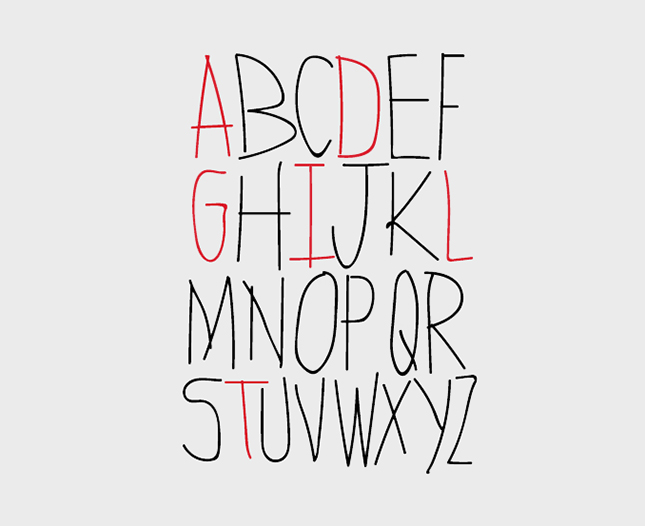
Image Source: www.aumcore.com
It can be advantageous for your business to consider going after development of its own typeface. While it takes time and investment in the beginning, people enjoy diversity and what better of a way to show it then having a personalized font. One that’s enjoyable enough for the user to look at for extended periods of time can go a long way in building company reputation and brand likeability with consumers.
2. Variable Fonts
Announced in mid-September of 2016, a jointly development project by Microsoft, Google, Apple, and Adobe was officially introduced to the public. What was the project? It’s being called an “OpenType Variable Font” and it can actually change the way in which we comprehend responsive web design. Best described by Adobe Typekit Blog in reference to what a variable font is; “Imagine raising your favorite font’s x-height just a touch at small sizes. Imagine sharpening or rounding your brand typeface in ways its type designer intended, for the purposes of art direction. Imagine shortening descenders imperceptibly so that headings can be set and tight without letters crashing into one another. Image all this happening live on the web, as a natural part of responsive design.”
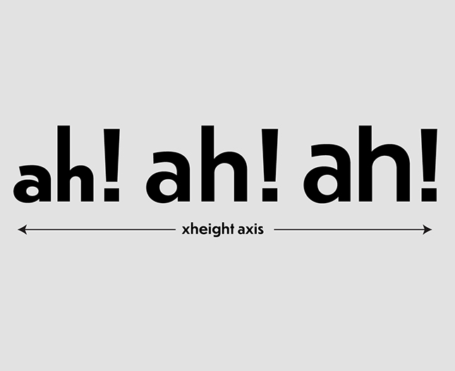
Image Source: www.typographica.org
This flexible solution in online typefaces is the just the beginning for new tool sets to be used by designers.
3. Tiny or Large?
When it comes to displaying words on a computer screen, one of the more highly discussed topics is how and why size comes into play. Bigger sized fonts can help convey a powerful message in a way that doesn’t seem overly repulsive for consumers to view. On the other hand, smaller texts allow your brand to better display a highlighted product or service so that the focus is visually set. The trend for 2017? Either go big or go small, the middle ground is slowly going out of fashion. Spend time with your marketing team and see which type will fit best with the brand image you are trying to present.
4. Handwriting for the Win
Handwritten typefaces are becoming more popular than ever. We’re beginning to notice that a larger number of brands are using a handwritten font for their webpages, visual logos, and social representations. The reason for this is simple; It creates a friendly and welcoming feel for users who are delving into a business’s webpage. The uniqueness of a font can go a long way in guiding a consumer through a targeted user journey in which a company wants to build a story. This can be anywhere from introducing a new product or explaining the behind the scenes details regarding development projects.
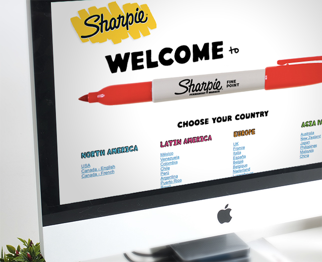
Image Source: www.aumcore.com
This blog gives plenty of great free handwriting fonts available for the public if this type of typography trend works best for your brand.
5. Mix and Match Your Design
A rather interesting movement we have seen in 2016 and are sure to see in 2017 is this idea behind using different typefaces together to create a larger arrangement theme. In this blog by Elegant Themes, it explains that a mixed and matched design; “…doesn’t just mean a variation on a single font, but a carefully matched se of very different fonts that play on each other’s idiosyncrasies to create an overall visual effect.” Effectively bringing together different styles in topography can lead to a better visual representation of your brand thus making consumers more eager to interact with what products/services your business has to offer.
6. Different Fonts Have Different Personalities
According to this study by Wichita State University, fonts such as Times New Roman, Arial, and Cambria all reach people who have stable personalities, while fonts such as Gigi, Kristen, and Rage Italic tend to please people who are more creative.
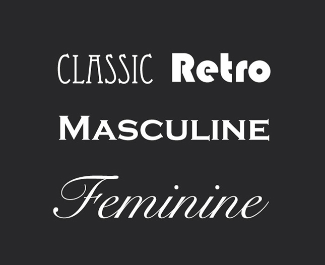
Image Source: www.squarespace.com
Companies are starting to recognize that different fonts attract different consumer audiences and in today’s digital driven world this can make or break a campaign to drive more customer leads. Try out different fonts and see which ones connect better than others.
7. Responsive is a Must
To maintain good responsive design practices, you must consider how a font looks on diverse list of devices including smartphones, tablets, laptops, etc. Your brand’s typeface must be able to shrink and grow accordingly to screens dimensions. If it isn’t responsive, then users will have a hard time reading what content is on your web page. With new ways of accessing the internet, this is a trend that will continue to be hugely important for years to come.
8. Best Font for a Mobile Website?
Piggy backing on the last point, the importance of having a font that is clearly visible on all different smartphone screen resolutions is imperative for your business. With around 72% of adults in the United States owning a smartphone in 2016, the significance behind providing responsiveness for your business’s typefaces and a pleasant mobile user experience design is tremendous. But what is the best font? Many sources will tell you that “San Serif Fonts” are your best bet when displaying content on mobile devices.
Image Source: www.aumcore.com
Their versatility for different platforms and easy to read structure makes their fonts the best for smartphones and tablets alike.
9. Geometric
A modernist approach to displaying words, the sharpness and defined feel that geometric letters have on a web page are awe-inspiring. A popular direction of typography that we are sure to see in 2017 is this style of almost cube like letter writing. Eye grabbing and a futuristic impression, geometric fonts can intrigue an audience on many different levels.
10. The Most Used Typography Fonts in 2016
According to a research study done by Hongkiat, the top 10 free and paid fonts mentioned by web and graphic designers were:
- Myriad Pro (Free)
- Bebas Neue (Free)
- Ubuntu (Free)
- PT Serif (Free)
- Futura (Paid)
- Helvetica (Paid)
- Fedra Sans (Paid)
We’ll be sure to keep an eye on these moving forward in 2017.
A Quick Wrap-Up
As beautifully explained by the digital marketing agency Aumcore:
“It’s easy to see why Typography has evolved into its own discipline within design. An image with the power to influence thought and behaviour is art and those with creative aptitude can harness the power of that art in lucrative ways throughout diverse industries.”
Typography is just one of the many ways a brand can convey a message that resonates deeply with their targeted audience, creating an emotional experience for users who explore their webpages. Let your words say more than 1000, in meaning and visual approach.
Photo Credit: Jon Tan
