Archive: Feb 2013

  1. 20 Inspiring Typography-Focused Website Designs

    Comments Off on 20 Inspiring Typography-Focused Website Designs

    When it comes to typography, we’ve come a long way since Johann Gutenberg used the first typeface for his printing press.  As the industrial age and later, the digital age, allowed for more control over type style with methods like hot metal typesetting, computers and digital printing, typography added an extra element to ordinary copy.

    In web design and digital marketing, we use copy to share an idea, communicate basic information or label sections of a website; by applying typography to the text, we can add style to our message with different type faces, weights, or sizes.  The greeting “Hello!” can be read and understood in a number of different ways depending on the font used.  An elaborate serif font might make it appear stiff, stern, and business-like.  Show “hello” in a modern version of a ’60s script and it might look friendly and creative.  In the worst-case scenario, apply Comic Sans – truly a designer’s nightmare  – to the phrase and it may seem silly and childish.  Here are 20 websites – representing everything from food to fashion to ad agencies – that illustrate great typography.
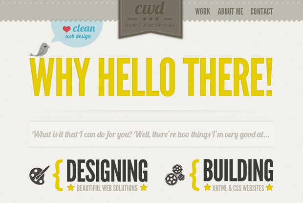
     

    ContempoWorldDesignCoUk2

    U.K. designer Charles Parmentier’s portfolio website uses bold sans serif fonts to make a statement about what he does.

    Source: http://www.contempoworld-design.co.uk/


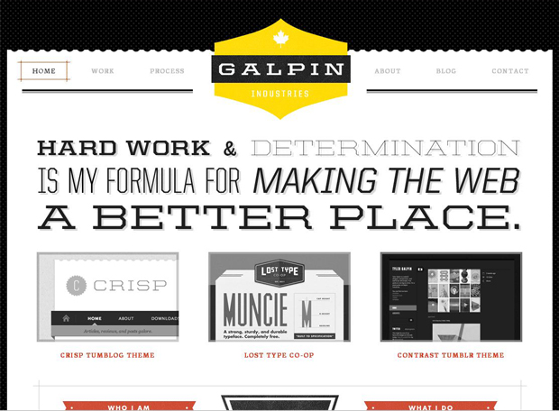
    Galpin2

    Canadian designer Tyler Galpin’s website mixes slab serif and sans serif typefaces in different font weights and sizes to draw readers’ eyes to the key ideas of his work philosophy.

    Source: http://www.galp.in


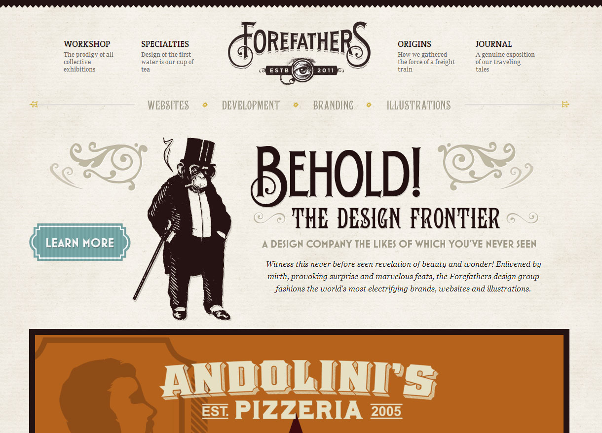
    forefathers high res

    Forefathers Group, a design company, has mixed antique-inspired type with modern styles to give their website both an old-timey and fresh look.

    Source: http://www.forefathersgroup.com


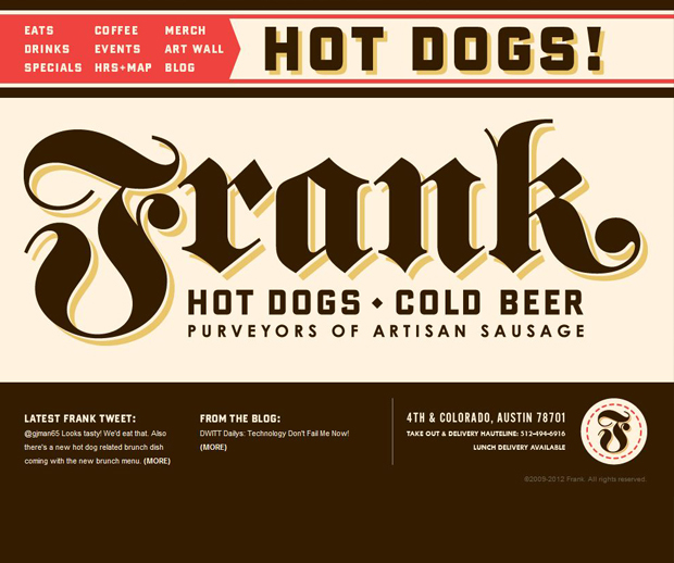
    HotDogsColdBeerCom2

    Design group Helms Workshop created the website for Frank, a hot dog and beer restaurant.  They’ve used a bold, serif typeface similar to the Old English-inspired Frankenstein in a commanding (but tasty-looking) dark brown for the eatery’s logo.

    Source: http://www.hotdogscoldbeer.com


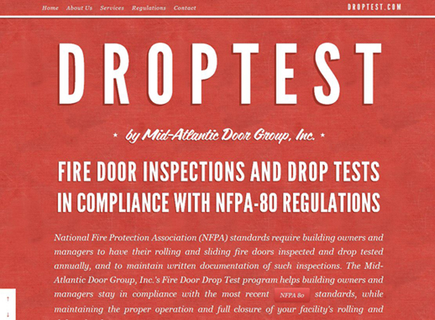
    DropTest2

    Tall, white sans serif lettering atop a fire engine red background gives this commercial fire door sales and services company a sense of urgency.

    Source: http://www.droptest.com


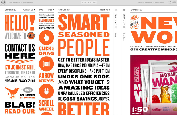
    GripLimitedCom2

    Canadian advertising agency Grip Limited has lots of words on their site! The amount of copy could be overwhelming to some, but different typeface weights and colors break up the information effectively.

    Source:  http://www.griplimited.com/


    GrupowProjectsComFolicure2

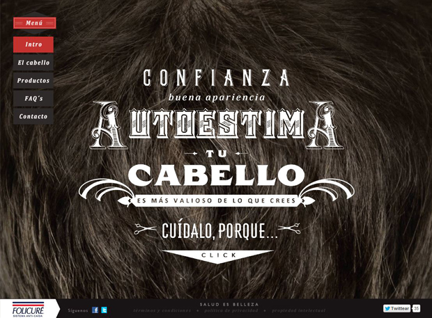
    The website for Mexican hair strengthening product Folicuré uses antique-inspired novelty fonts that call to mind an old-fashioned barber shop.

    Source:  http://www.grupowprojects.com/folicure/


    DanielMartIn2

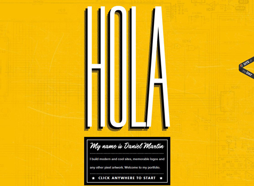
    Daniel Martin has used a mix of san-serif type and script over a yellow background to make his portfolio website modern and inviting.

    Source: http://www.danielmart.in
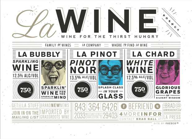
     

    LAWineAgencyCom2

    L.A. Wine Agency’s website uses grotesque sans serif type with a small splash of a bold, serif font to give a sophisticated, yet playful vibe.

    Source: http://www.lawineagency.com


    LickMeImDeliciousCom2

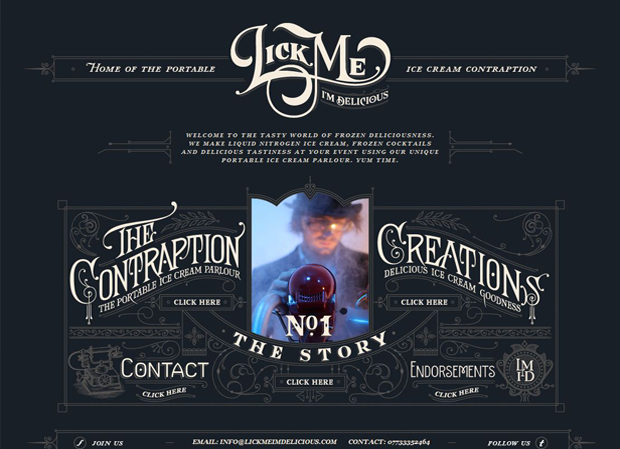
    This quirky portable ice cream company specializes in making the dessert on their “contraption” as tasty entertainment for events.  They’ve used late-1800s-inspired type to create an old-fashioned feel.

    Source: http://www.lickmeimdelicious.com


    MitchellSheperdCom2

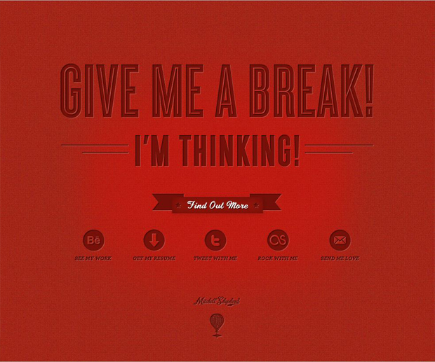
    Designer Mitchell Shepherd’s portfolio website makes a powerful yet minimalist impression with bold, crimson sans serif type over a red background.

    Source: http://www.mitchellshepherd.com/


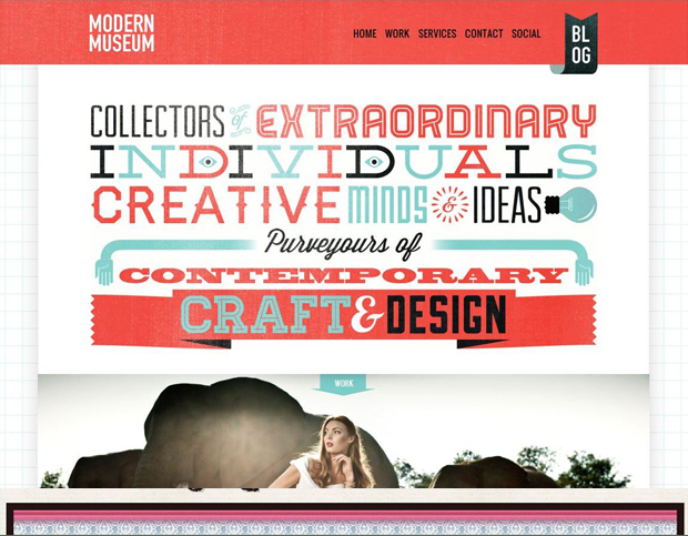
    ModernMuseumCoZa22

    This South African advertising and design firm has a letterpress-inspired greeting that uses script, slab serif, novelty, and sans serif typefaces.

    Source: http://www.modernmuseum.co.za/


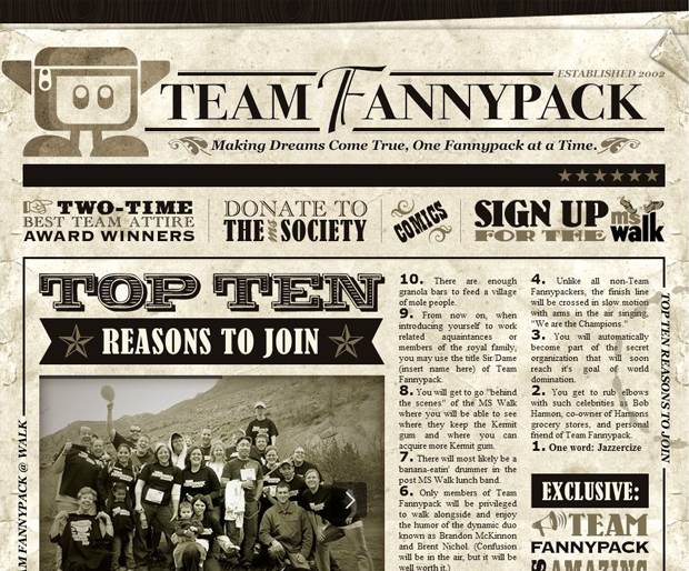
    TeamFannypackCom2

    This newspaper-style website for Team Fannypack, a fundraising walking team, uses novelty type to show off the group’s sense of fun and humor.

    Source: http://teamfannypack.com/
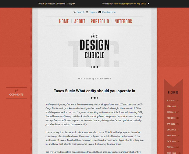
     

    TheDesignCubicleCom2

    The Design Cubicle’s minimalist aesthetic uses plenty of white space and sans serif type (with a just small bit of serif) to create a sleek and informative site.

    Source: http://www.thedesigncubicle.com/


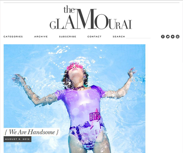
    TheGlamouraiCom2

    This fashion blogger’s site reflects her glamorous and creative sense of style with sophisticated-looking transitional serif type.

    Source: http://www.theglamourai.com


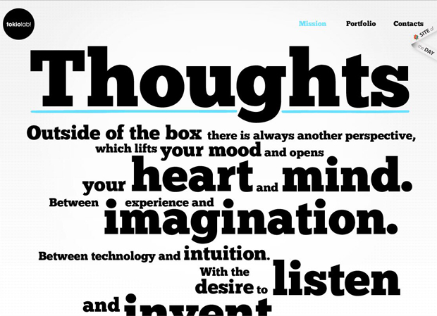
    TokioLabCom2

    Italian design group Tokiolab! uses oversized a bold, slab serif font to make a statement about their creative mission.

    Source: http://www.tokiolab.it


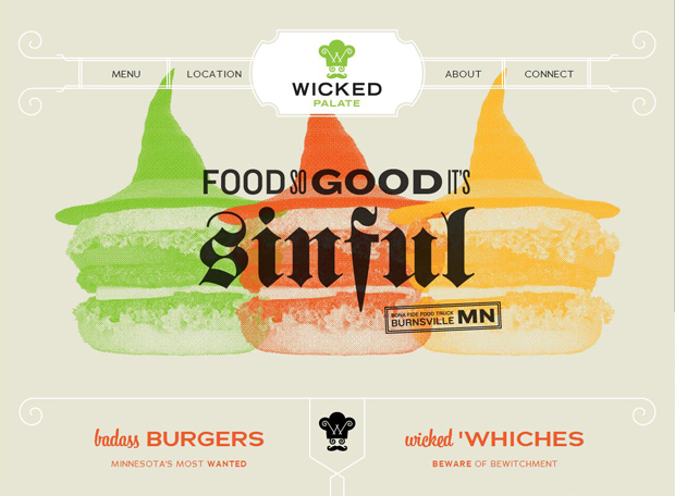
    WickedPalateCom2

    Gourmet food truck Wicked Palate’s website drives the point of their delicious food with a bold and devilish gothic font.

    Source: http://www.wickedpalate.com


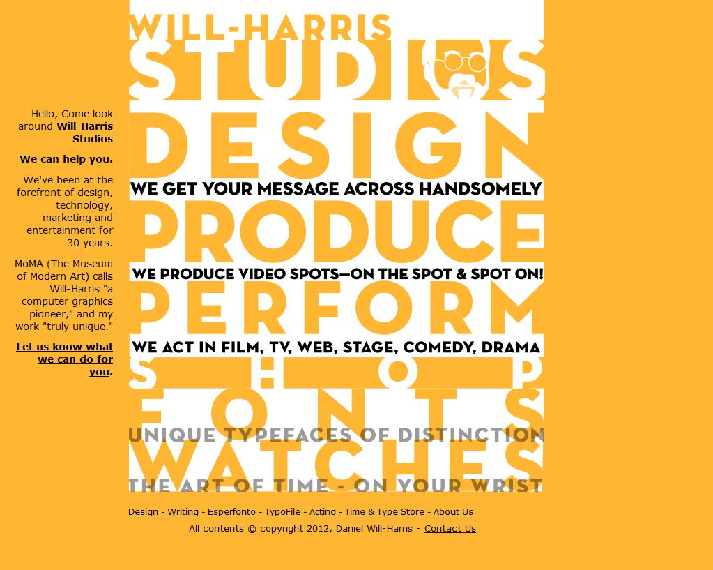
    WillHarrisCom2

    All-around creative professional Daniel Will-Harris is a graphic designer, writer, actor and producer…who also designs watches.  His website features sans serif type to clearly describe everything he does.

    Source: http://www.will-harris.com


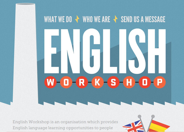
    EnglishWorkshopEu2

    Spain-based English Workshop’s website uses a loud-and-clear sans serif type.

    Source: http://www.englishworkshop.eu


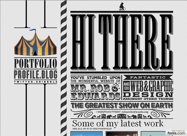
    RobEdwardsOrg

    Web and graphic designer Rob Edwards puts his creative skills front-and-center using a variety of novelty typefaces on his circus-themed website.

    Source: http://www.robedwards.org

    If you’ve enjoyed this collection of awesome typography based websites then make sure you share the love and tweet it out!


    Did you like this Article?

    [one_half]If so, why don’t you consider subscribing to The Design Range Newsletter? You’ll be kept informed once a fortnight on all the latest articles as well as exclusive tips and tutorials on increasing your income from graphic design.[/one_half][one_half_last]

    [/one_half_last]

  2. Reasons Entrepreneurs Part Ways with Their Logos

    Comments Off on Reasons Entrepreneurs Part Ways with Their Logos

    If there’s one thing that most successful businesses have in common, it’s the fact that they have a logo. Even if said logo is a just a company’s brand name, this image helps a company build brand recognition in numerous ways. Most entrepreneurs understand the power of a good logo before they decide to go into business, and many work with designers to create a winning business logo before launching.

    However, it’s not at all uncommon for businesspeople to grow tired of that logo and to want it changed. Some very successful companies have changed their logo around for the purposes of rebranding, but does this mean it always a good move?

    Conventional wisdom suggests that a business should stick with its logo. If one of your clients are thinking about making changes, then it’s important that they avoid the trash heap. Instead, think about minor changes which will make the existing logo more attractive, like Apple’s new apple or the improved hue of McDonald’s golden arches.

    If you’re clients aren’t tired of their logo just yet, the day may still come when they decide to change it. Below, we will go over a few reasons why clients often most decide to make this change, and whether or not it’s really a good move for them.

    5 Reasons People Abandon Old Logos

    1 The Image Grows Tiresome

    Although most businesspeople don’t realize this, they’re seeing their own logo exponentially more than anyone else is seeing it. A business owner is laying eyes on that logo every time he or she develops marketing material, looks at the website, hands out a business card, etc. In a sense, it’s like saying your name a dozen times. After about 8, you begin to think, “’Erick’ sure sounds like a weird name!” This may cause you to want to change your logo, but resist the temptation.

    2 Business is Slow

    Some business owners believe that their business is directly tied to their logo. Sure, a huge international brand like Coke may do outstanding business in part based on their logo’s recognition, but it certainly wasn’t always like that, and it’s certainly not always the case. Your business being slow means you need a new marketing direction, not a new logo change. When you get a logotype that has become the face of your brand, you should stick with it.

    3 The Boredom Bug Bites

    Yeah, business isn’t always exciting. It’s a whole lot like work! So while you’re clients may be used to making changes on their websites, rewriting their mission statements and touching up their links, etc, they may also decide, “Hey, I should change my logo while I’m at it.” If they get that bored, open Photoshop and tinker around with new ideas, but warn them not to replace their logo just yet. Keep the other versions stored and use them for potential updates in case you ever really need a change.

    4 Your Brand Becomes Tarnished

    This is a case where it’s probably important to change your logo, or at least everything the logo represents. In today’s age of social media, it’s easy for a brand to become tarnished through no real fault of its own. Bad reviews can go viral in a hurry. So many start-up brands have barely experienced liftoff before having to change things around, and even some established brands have had to refocus.

    5 New Marketing Ventures

    Venturing into new markets often stands as a solid reason for a logo change. This might not be the case for your clients, but if you’re anything like eBay (story here), then you might realize that the decade-old logo just doesn’t play well with a more sophisticated user experience online via HD screens, streamlined browsers, social media and mobile devices. So targeting new markets may—or, again, may not—require a logo change.

    Reasons to Stick with a Good Thing, Unless…

    Services like Logosack make it easy for clients to create a winning logo for their brand, and also make it easy to change. But the fact of the matter is that it’s much better to stick with an original, well thought out and personalized logo than to go with something new.

    Even if you do decide on changing, those changes should be subtle. Look at a company like NIKE. Instead of changing their main logo, they’ll sometimes just change the shadowing, add another aphorism on top of the old logo for a marketing campaign, or change the color. The end result appears to be a brand new logo, but its actual still the same old NIKE.

    The same holds true for a brand like Red Bull. Though the color scheme may change in the background, the two bulls and the lemon-yellow sun remain consistent.

    Ultimately, you’re clients should want to stick with their logo because it’s the face of thier brand. How would your loved ones react if you just walked into the house one day with a new face? Probably not well! So, the bottom line: Stick it out with your logo concept, unless you’re planning on some minor changes for marketing purposes.

    Photo Credit to ElegantePress

    Did you like this Article?

    [one_half]If so, why don’t you consider subscribing to The Design Range Newsletter? You’ll be kept informed once a fortnight on all the latest articles as well as exclusive tips and tutorials on increasing your income from graphic design.[/one_half][one_half_last]

    [/one_half_last]
  3. Tips for Choosing a Printing Company

    1 Comment

    The services of a professional printing company can prove highly useful when you need to complete a large or complex project, such as creating a banner or mass producing a brochure. But not all printing companies are created equal, and if you want to ensure the maximum value for your hard-earned dollar, you must do your homework before settling on any company. Here are some important variables to consider:

    Services Required

    If you need to print 500 copies of a report, you should have little trouble finding an affordable rate from just about any printer. But if your needs require the design of a menu, or the creation of a full-sized, high-resolution poster, you will likely need to shop around. When comparing printing companies, always determine the specific services offered, and go with a company that’s truly equipped to meet your individual needs.

    Cost

    Let’s face it. Cost is one of the most important variables in any major buying decision. But when you’re choosing a printing company, cost assessment can be tricky. For instance, let’s say that you want to order a thousand custom postcards, and Printing Company A offers them at 5 cents per card while Printing Company B offers them at 7 cents per card.

    When you’re choosing a printing company, cost assessment can be tricky

    On the surface, the difference may seem hardly worth considering, but do the math. A thousands postcards from Company A will run you $50, while a thousand postcards from Company B will cost $70. Suddenly the difference isn’t so trivial. Always consider the numbers when dealing with large quantities, and look for companies that offer bulk deals.

    Local or Online?

    Once again, this variable will depend largely on your individual needs. If you simply need a few basic business cards or newsletters, your local print shop will likely be able to accommodate you same day and provide instant gratification, but if you need professional custom designs for a series of bookmarks, or if you require the creation of elegant folded cards or slick yard signs, the online marketplace usually has more to offer. In addition, an online printing company will usually offer the best values, but make sure to factor in the cost of shipping and handling when comparing prices.

    Quality of Work

    If you need specialized designs for custom club flyers, banners, posters or even DVDs, you will need to work with a printing company that offers creative services. There are plenty of options available, but don’t choose blindly. Look at examples of each company’s work and compare the different templates offered. When you find a company that takes your breath away with its colorful, custom designs, you will know that you’ve found a winner.

    Choosing a printing company is simply about assessing your needs, researching your options and finding the right fit. With a bit of research and a few comparisons, you should have no trouble finding the ideal printing service at an extremely reasonable price.

    Photo Credit to mattack

    Did you like this Article?

    [one_half]If so, why don’t you consider subscribing to The Design Range Newsletter? You’ll be kept informed once a fortnight on all the latest articles as well as exclusive tips and tutorials on increasing your income from graphic design.[/one_half][one_half_last]

    [/one_half_last]